
.jpg)
Let’s talk growth.

O My Bag is an Amsterdam-based sustainable bags brand — B Corp certified, fair trade, and deeply committed to transparency about how their products are made. With a growing range, an expanding international audience, and a new digital product passport launching in partnership with Renoon, it was the right moment to bring the storefront in line with where the brand had arrived. GoodKarma was brought in to redesign three core pages with a clear north star: make the brand feel as good as it is, and remove every reason a customer might hesitate.
The pages in scope had evolved through many rounds of updates and additions rather than a single considered strategy, which is the case for many growing brands. Products were competing with the header for attention on mobile. The product page carried a lot of valuable information without a clear hierarchy. And the Our Story page, home to some of O My Bag's most compelling content about factories, living wages, and the founder story, wasn't making it easy enough to find any of it. For a brand whose ethics are a real point of difference, that was important to fix.
GoodKarma works from the conviction that brand and performance go hand in hand: the best-converting pages are the ones that tell a story clearly and make the next step feel obvious.
We started with a structured briefing process, a review of the customer experience across all devices and a competitive analysis of brands O My Bag admired: Reformation, Everlane, Eileen Fisher, Saye, Alohas. From there, we moved into wireframes before touching any visual decisions - a deliberate step. By separating structure from aesthetics, feedback in the early rounds stayed focused on what mattered: content hierarchy, what deserves prominence and what earns its place on the page.
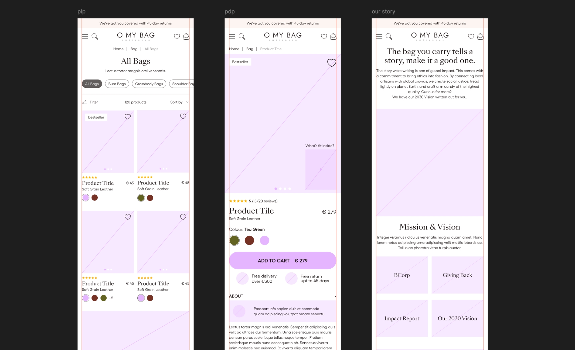
The redesign gets out of the way first, then adds value. Products are visible the moment you land. Filtering is easier and more accessible. The product cards are cleaner and more consistent.
The more interesting decision was what to leave out. We recommended against a quick-add button: at this price point, the goal is to move customers to the product page, not to shortcut past the experience being built there. The storytelling blocks woven into the product grid are there for the same reason: commerce and storytelling aren't separate, and the collection page is the right place to start that conversation.
The redesign was built around one question: what does a customer need to feel confident buying a €300+ bag and in what order?
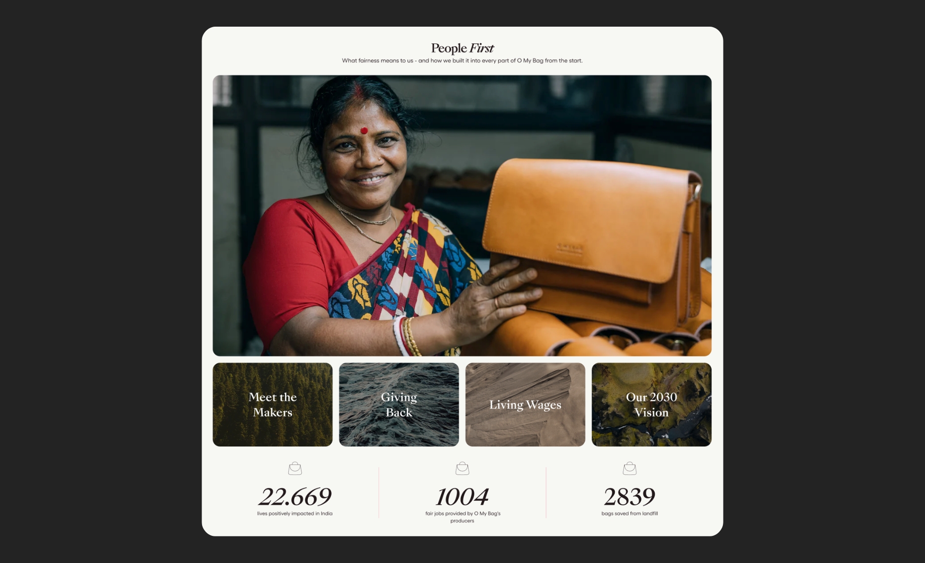
The "what fits inside" content moves into the main gallery where it gets seen immediately. The digital product passport is designed as a native part of the page with both a compact and more detailed explanation, serving the different types of customers. The lower half of the page becomes a flexible storytelling canvas: modular components that can be assembled differently per product, giving O My Bag's depth of content about leather sourcing, tanneries, and craftsmanship a place to actually land.
The Complete the Look section uses quick-add, a deliberate change from the collection page strategy: complementary, lower-priced accessories have a different purchase logic than the main item.
The page now works as both an overview and a navigation tool: four clear thematic pillars, a sticky nav that lets customers jump directly to what they're looking for and short section introductions that link out to deeper sub-pages for those who want more. The founder story, previously a few clicks away, is given the prominence it deserves. Impact statistics and brand slogans are present but more restrained; they land harder when they're not competing with each other.
The guiding principle from the wireframe sessions was simple: this page should feel like a home to all the brand’s content, not a page that tries to tell every story at the same time.
The thread running through all three pages is the same idea: O My Bag's commercial ambitions and ethical ones aren't in tension; they're the same ambition. A customer who understands where their bag comes from and who made it is more likely to buy, and more likely to come back. The redesign makes that story easier to find, easier to follow, and easier to trust.